• Jetzt anmelden. Es dauert nur 2 Minuten und ist kostenlos!

Flex-Anordnung von eingabfelden

kaysiebke

Mitglied
Guten Tag an die Gemeinde!
Ich habe eine Frage, da ich mit der Flex Funktion nicht ganz warm werde !
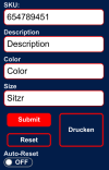
Und zwar habe ich 4 eingab Felder, die ich untereinander angeordnet habe(SKU, Beschreibung, Farbe, Größe).
Nun möchte ich die Letzten zwei eingab Felder (Farbe, Größe gern nebeneinander anordnen. Wie stelle ich das inzwischen in der CSS regel, an das ich dies nebeneinander bekomme?


Code:
<style>
        /* Anordnung der Buttons */
        .btn-container {
            display: grid;
            grid-template-columns: 1fr 1fr;
            column-gap: 0.5em;
        }
        #btnPrint {
            grid-column: 2/3;
            grid-row: 1/3;
        }
        #btnSubmit {
            grid-column: 1/2;
            grid-row: 1/2;
        }
        #btnReset {
            grid-column: 1/2;
            grid-row: 2/3;
        }
    </style>

Code:
  </div>
            <form id="itemForm" autocomplete="off">
                <label for="sku">SKU:</label>
                <input type="search" id="sku" name="sku">
                <label for="description">Description:</label>
                <input type="search" id="description" name="description">
                <div class="flexitem-1">
                <label for="color">Color:</label>
                <input type="search" id="color" name="color">
                <div class="flexitem-2">
                <label for="size">Size:</label>
                <input type="search" id="size" name="size">
                <div class="btn-container">
                    <button id="btnPrint" class="button" type="button" value="Print" onclick="window.print()">Drucken
                    </button>
                    <button id="btnSubmit" class="button" type="button" value="Submit" onclick="submitForm()">
                    </button>
                    <button id="btnReset" class="button" type="reset" value="Reset">
                    </button>
                </div>
 

Anhänge

  • Bildschirmfoto vom 2024-09-16 16-23-12.png
    Bildschirmfoto vom 2024-09-16 16-23-12.png
    25,7 KB · Aufrufe: 10
  • Bildschirmfoto vom 2024-09-14 19-55-43.png
    Bildschirmfoto vom 2024-09-14 19-55-43.png
    55 KB · Aufrufe: 5
Zuletzt bearbeitet:
Werbung:
Ich sehe CSS-Grid für dein Vorhaben sinnvoller als Flex, wie offensichtlich msi auch.

Ich habe mal eine Beispieldatei erstellt. Dabei ging es mir nur um die Anordnung der Formularfelder und Buttons, nicht jedoch um Farben, Hintergründe und ähnliches, was später angepasst werden kann.

Speziell das CSS mag etwas unübersichtlich erscheinen. Für Testdateien habe ich aber eigene Vorlagen erstellt, die ich dann natürlich auch nutze.

Die Formularfelder sind durch meine Eigenvorlage bereits an unterschiedliche Bildschirmbreiten angepasst. Bei der Anordnung der Buttons habe ich mich an deine Vorlage gehalten. Die können natürlich auch an unterschiedliche Bildschirmbreiten angepasst werden.

Du kannst die Datei ja einfach mal testen:

Code:
<!DOCTYPE html>
<html lang="de">
<head>
   <meta charset="utf-8">
   <title>Formularlayout</title>
   <meta name="description" content="Platzhalter - Ein kurze Beschreibung des Inhalts in Satzform">
   <meta name="viewport" content="width=device-width, initial-scale=1.0">

   <!-- <link href="../css/zentrale.css" rel="stylesheet"> -->

   <style>

   /* Überschriften - font-family: 'Roboto Slab', Serif; */
   @import url(https://fonts.googleapis.com/css?family=Roboto+Slab);

   /* Fließtext - font-family: 'Roboto', Sans-Serif"; */
   @import url(https://fonts.googleapis.com/css?family=Roboto);

   /* Basisangaben */
   @media all {
      * {
         /* box-sizing: border-box; */
         min-width: 1px;
      }
      html {
      }
      body {
         max-width: 1200px;
         margin: 0rem auto 0rem auto;
      }
   }

   /* Schriften */
   @media all {
      html {
         font-family: sans-serif;
         font-size: 120%;
         line-height: 1.3;
      }
      h1 {
         font-family: 'Roboto Slab', serif;
         font-size: 1.2rem;
         letter-spacing: 0.1rem;
         margin: 0.5rem 0rem 0.5rem 0rem;
      }
      p, li, dl, dt, address {
         font-family: Roboto, sans-serif;
         font-size: 1rem;
         font-style: normal;
         margin: 0.5rem 0rem 0.5rem 0rem;
      }
   }

   /*Forms normalize*/
   @media all {
      button,
      input,
      optgroup,
      select,
      textarea {
         color: inherit;
         font: inherit;
         margin: 0;
      }
      button {
         overflow: visible;
      }
      button,
      select {
         text-transform: none;
      }
      button,
      html input[type="button"],
      input[type="reset"],
      input[type="submit"] {
         -webkit-appearance: button;
         cursor: pointer;
      }
      button[disabled],
      html input[disabled] {
         cursor: default;
      }
      button::-moz-focus-inner,
      input::-moz-focus-inner {
         border: 0;
         padding: 0;
      }
      input {
         line-height: normal;
      }
      input[type="checkbox"],
      input[type="radio"] {
         box-sizing: border-box;
         padding: 0;
      }
      input[type="number"]::-webkit-inner-spin-button,
      input[type="number"]::-webkit-outer-spin-button {
         height: auto;
      }
      input[type="search"]::-webkit-search-cancel-button,
      input[type="search"]::-webkit-search-decoration {
         -webkit-appearance: none;
      }
      fieldset {
         padding: 0.5rem 0.5rem 0.5rem 0.5rem;
         border: 1px solid #c0c0c0;
         margin: 0 2px;
      }
      legend {
         border: 0;
         padding: 0;
      }
      textarea {
         overflow: auto;
      }
      optgroup {
         font-weight: bold;
      }
      div>label::after {
         /*content: ":";*/
      }
      label,
      input,
      select,
      textarea {
         font-size: 1.2rem;
         padding-left: 0.5rem;
         padding-right: 0.5rem;
      }
      .formular h2,
      .formular p,
      .buttons button {
         font-size: 1.2rem;
      }
      input:focus,
      select:focus,
      option:focus,
      textarea:focus {
         background-color: hsla(180, 100%, 94%, 1);
      }
      .formlayout :invalid {
         border-color: red;
      }
      button {
         background-color: #ddd;
         background-image: linear-gradient(#eee, #ccc);
         color: #333;
         text-shadow: 0 1px 0 rgba(255,255,255,.8);
         box-shadow: 0 0 1px 1px rgba(255,255,255,.8) inset, 0 1px 0 rgba(0,0,0,.3);
         border-color: #777;
         border-radius: 0.3rem;
      }
      button:hover {
         background-color: #eee;
         background-image: linear-gradient(hsla(180, 100%, 94%, 1), hsla(180, 100%, 94%, 1));
      }
      button:focus {
         background-color: #fafafa;
         background-image: linear-gradient(hsla(180, 100%, 94%, 1), hsla(180, 100%, 70%, 1));
      }
      button:active {
         box-shadow: 0 0 4px 2px rgba(0,0,0,.3) inset;
      }
      .formular,
      .formular * {
         box-sizing: border-box;
      }
      .formlayout>div {
         margin-top: 1rem;
      }
      .formlayout>div:not([class])>*,
      .formlayout>div.radiowahl>*,
      .formlayout>div.checkboxwahl>* {
         display: block;
         width: 100%;
      }
      input,
      select,
      section,
      textarea {
         padding: 0.1rem 0.3rem;
         border: 1px solid gray;
         border-radius: 0.4rem;
      }
      .formlayout .radiowahl span,
      .formlayout .checkboxwahl span {
         display: block;
         width: 100%;
      }
      .formlayout .radiowahl span label,
      .formlayout .checkboxwahl span label {
         width: 100%;
      }
      .formlayout .radiowahl span label:hover,
      .formlayout .radiowahl span label:focus,
      .formlayout .radiowahl span label:active,
      .formlayout .checkboxwahl span label:hover,
      .formlayout .checkboxwahl span label:focus,
      .formlayout .checkboxwahl span label:active {
         background-color: lightgreen;;
      }
      .btn-container {
         padding: 0.2rem 0.3rem;
         display: grid;
         gap: 0.5rem;
      }
   }

   /*Formular (mobile First)*/
   @media all {
      #itemForm {
         padding: 1rem;
         max-width: 1400px;
         margin: 0rem auto 0rem auto;
      }
   }
   @media only screen and (min-width: 800px) {
      .formlayout>div {
         display: grid;
         grid-template-columns: 14rem 1fr;
      }
   }
   @media only screen and (min-width: 1100px) {
      .formlayout {
         display: grid;
         gap: 0.5rem 1rem;
         grid-template-columns: 1fr 1fr;
      }
      .formlayout>div {
         margin-top: 0rem;
      }
      .formlayout>div:not([class]) {
         display: block;
         width: 100%;
      }
      .formlayout>div:nth-child(3),
      .formlayout>div:nth-child(4) {
         grid-column-start: 1;
         grid-column-end: 3;
      }
   }

   /*Buttons (mobile First)*/
   @media all {
      .btn-container {
         padding: 0.5rem 0rem 0.5rem 0rem;
         max-width: 1400px;
         margin: 1rem auto 0rem auto;
         display: grid;
         grid-template-columns: 1fr 1fr;
         gap: 0.5rem;
      }
      .btn-container>* {
         font-size: 1.2rem;
         text-align: center;
         padding: 0.5rem;
         border: 1px solid grey;
         border-radius: 0.5rem;
         margin: 0rem;
         display: grid;
         justify-content: center;
         align-content: center;
      }
      .btn-container>:nth-child(1) {
         grid-area: 1 / 2 / 3 / 2;
      }
   }

   </style>
</head>
<body>
   <header id="pageheader" class="pageheader">
      <h1>Formularlayout</h1>
   </header>
   <main id="content" class="content">

      <form id="itemForm" autocomplete="off">

         <div class="formlayout">
            <div>
               <label for="sku">SKU:</label>
               <input id="sku" name="sku" type="search">
            </div>
            <div>
               <label for="description">Description:</label>
               <input id="description" name="description" type="search">
            </div>
            <div>
               <label for="color">Color:</label>
               <input id="color" name="color" type="search">
            </div>
            <div>
               <label for="size">Size:</label>
               <input id="size" name="size" type="search">
            </div>
         </div>

         <div class="btn-container">
            <button id="btnPrint" class="button" type="button" value="Print" onclick="window.print()">Drucken</button>
            <button id="btnSubmit" class="button" type="button" value="Submit" onclick="submitForm()">Submit</button>
            <button id="btnReset" class="button" type="reset" value="Reset">Reset</button>
         </div>

      </form>

   </main>
   <footer id="pagefooter" class="pagefooter">
      <p>Originaldiskussion: <a href="https://www.html.de/threads/flex-anordnung-von-eingabfelden.61867/">https://www.html.de/</a></p>
   </footer>
</body>
</html>
 
Werbung:
Das lässt sich relativ einfach mit https://cssgrid-generator.netlify.app/ feststellen, wie das geht.
Danke Ihr Link ist sehr hilfreich und funktioniert super (nur) für meine Eingabefelder:wink:
leider hat dies Auswirkung auf das nachfolgende Skript und ich weiß nicht wie ich das beheben kann!
Code:
 <div class="btn-container">
                    <button id="btnPrint" class="button" type="button" value="Print" onclick="window.print()">Drucken
                    </button>
                    <button id="btnSubmit" class="button" type="button" value="Submit" onclick="submitForm()">
                    </button>
                    <button id="btnReset" class="button" type="reset" value="Reset">
                    </button>
                </div>
                <label for="autoreset">
                    Autoreset:
                </label>
                <div class="flex-container">
                    <div class="onoffswitch">
                        <input type="checkbox" name="onoffswitch" class="onoffswitch-checkbox" id="autoreset">
                        <label class="onoffswitch-label" for="autoreset">
                            <span class="onoffswitch-inner"></span>
                            <span class="onoffswitch-switch"></span>
                        </label>
                    </div>
                </div>
Bildschirmfoto vom 2024-09-28 22-25-26.png
 
Zuletzt bearbeitet:
Was für Auswirkungen sollen die Änderungen auf das Script haben?

Wir können nur mit den Informationen arbeiten, die du uns zur Verfügung stellst. Die sind bislang noch recht mager.

Der fehlende Text zu den beiden linken Buttons liegt am fehlerhaften HTML.
 
Zuletzt bearbeitet:
Zurück
Oben